

A mission that deserved a better stage.
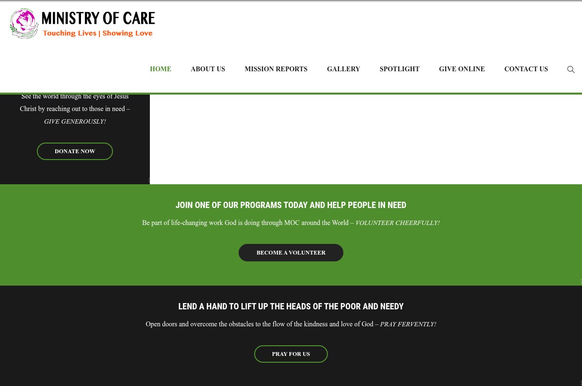
Before we came on board, The Ministry of Care's website was outdated, unengaging and visually flat, it didn't do justice to the impact of their work.
Outdated look
A dated interface that no longer reflected the scale and heart of the mission.
Low engagement
Dense, static pages gave visitors little reason to stay, explore or return.
Weak visual appeal
Imagery and layout failed to carry the emotion of the stories behind the work.
Unclear actions
Few clear, clickable paths to donate, volunteer or get involved.